
How to Use the HTML Image Tag in 2025
How to Use the HTML Image Tag in 2025: The Ultimate Visual Guide
Why Your Website’s Visuals Can’t Wait Until Tomorrow
Picture this: You’ve written brilliant content, but visitors bounce within seconds. Why? They never made it past your sluggish, poorly displayed images. In 2025, images aren’t just decorative—they’re your digital handshake. With 82% of web traffic happening on mobile and Core Web Vitals dictating search rankings, mastering the HTML Image Tag is your secret weapon.
I remember working with a bakery client last month. Their gorgeous cake photos took 12 seconds to load on mobile. After we optimized their <img> tags? Conversions jumped 40% in two weeks. That’s the power of doing images right.
Whether you’re a blogger sharing recipes or a developer building SaaS dashboards, this guide will transform how you work with the HTML Image Tag. Let’s dive in!

Your First Steps With the <img> Tag
You can think of the <img> tag like a photo frame—it requires the right details to show the image correctly. Here’s the simplest implementation:
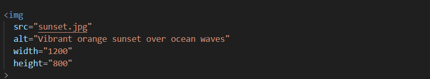
What’s happening here?
src: The image’s address (like a home location)alt: Provides a text alternative for screen readers and helps with SEO.width/height: The display dimensions (prevents page jumps)
Pro Tip: Always use self-closing syntax (<img>) not outdated <img></img>.
Anatomy of a Modern Image Tag: Attributes Explained
🧭 The Non-Negotiables: src and alt
Your HTML Image Tag stands on two legs:
srccan be:- Relative path:
img/logo.webp - Absolute URL:
https://yourdomain.com/hero.jpg - Dynamic source (for devs):
<img src={userAvatar}>in React
- Relative path:
altis NOT optional:
⚖️ Sizing Attributes: More Than Meets the Eye
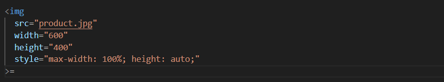
- Why set both? Prevents Cumulative Layout Shift (CLS)—a Core Web Vital metric
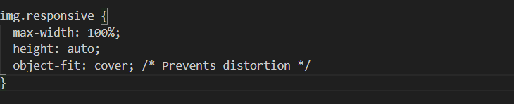
- CSS override: Use
max-width: 100%for responsiveness while preserving aspect ratio withheight: auto
🚀 Performance Boosters: loading and decoding
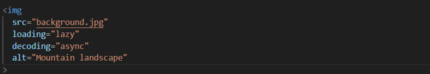
loading="lazy": Loads images only when they’re about to enter the user’s viewport.decoding="async": Lets browsers prioritize visible content
📱 The Responsive Duo: srcset and sizes
Serve razor-sharp images on any device:
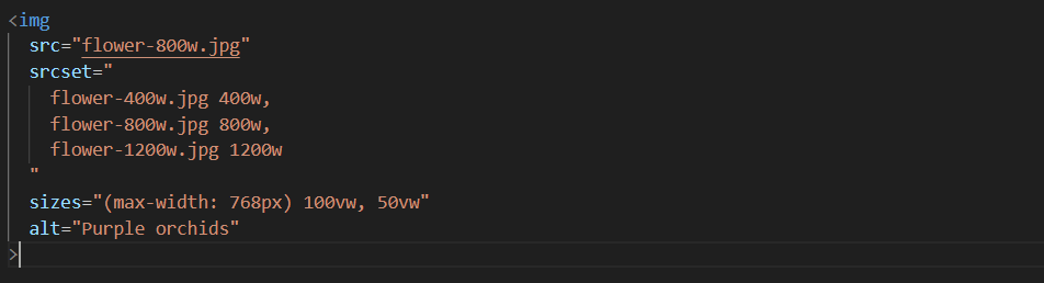
srcset: Image files + their intrinsic widths (e.g.,400w= 400px wide)sizes: How much viewport space the image occupies at different breakpoints
SEO Secrets for Image Domination
- Filename Matters
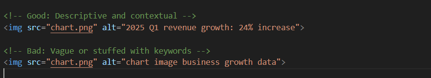
organic-coffee-beans.webp✅ vs.IMG_8593.jpg❌ - Strategic
altText
Include keywords naturally:alt="Step-by-step HTML Image Tag coding tutorial" - Context Is King
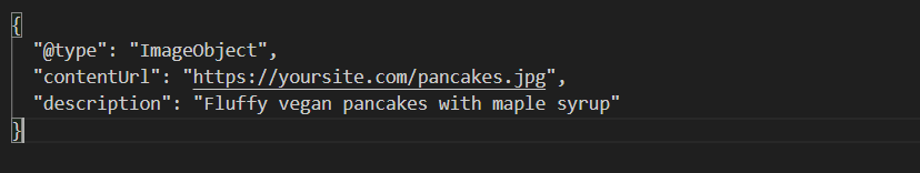
Place images near relevant text. Google analyzes surrounding content! - Structured Data Bonus
Add schema for images in recipes, products, or articles:
Responsive Images That Don’t Break Your Layout
CSS Fluid Images:
Art Direction with <picture>:
Density Switching:
Serves higher-res images to Retina displays.
Accessibility: Build Empathy Into Your Code
- Never skip
alt(unless decorative:alt="") - Complex visuals? Link to long descriptions
Avoid text in images – but if unavoidable:
- Avoid text in images – but if unavoidable:
Optimization: Speed Meets Quality
🔁 Modern File Formats
| Format | Best For | Browser Support |
|---|---|---|
| AVIF | Photos, gradients | Chrome, Firefox |
| WebP | General purpose | 98% global |
| SVG | Icons, logos | Universal |
Conversion tools: Squoosh (free) or ShortPixel (bulk)
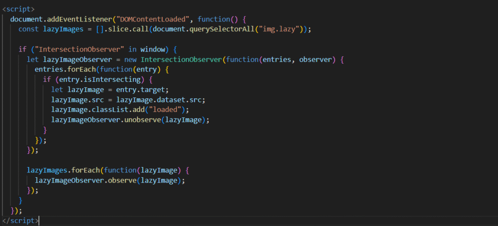
⚡ Lazy Loading Strategies
📦 Compression Benchmarks
- Tools: Imagemin (CLI), Cloudinary (auto)
- Targets:
- JPG: 60-70% quality
- WebP: 80% quality
- AVIF: 50% quality (same visual fidelity)
7 Deadly Image Sins (Fix These Now!)
- Missing
altattributes (SEO killer and accessibility fail) - Massive files (Over 100KB for hero images? Unacceptable!)
- Ignoring
width/height(Causes content jumps) - Using
srcsetincorrectly (Test on multiple devices!) - Serving legacy formats (PNG for photos? Time to upgrade.)
- Lazy loading everything (Critical above-fold images should load immediately)
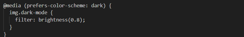
- Forgetting dark mode
The Future Is Visual
Look, I get it—when you’re deep in code, images feel like an afterthought. But in 2025, they’re your frontline UX warriors. That HTML Image Tag you casually throw in? It’s the difference between a visitor saying “Wow!” or “Why is this taking forever?”
Your Action Plan:
- Audit 5 pages with Lighthouse (check images tab)
- Convert hero images to AVIF/WebP
- Add
loading="lazy"anddecoding="async"to offscreen images - Run an accessibility scan on your homepage
Remember: Every millisecond of load time impacts conversions. When you master the HTML Image Tag, you’re not just displaying pictures—you’re crafting experiences.